
Icons and Skins by Paul Boyer (Mormegil)
View
Search

The Marathon Icons see their third Marathon in 3 months.

Jun 22, 2009 4:24 AM by Discussion: WinCustomize News

Despite the risk to my poor IPhone, I drug it along on the Mayors marathon yesterday so I could record a special thank you to everyone who bought the Marathon icons.  http://www.youtube.com/watch?v=na2MBQqZp3o

With your help, my wife and I were able to raise over $8000 dollars for LLS, If you include all the Team In Training runners who came to Alaska we raised over 1.7 million dollars. 

I will be able to continue selling the Marthon Icons for Team in training for at least the rest of the year, so tell a friend what a great deal they are and what a great cause they support.

Beside all that I want to say a personal thanks, your support made a big differance, and a huge shout out to Stardock for donating 100% of the sales, including bandwidh cost to the cause.

If you want to see more pictures form the race you can follow me mile by mile here. http://www.facebook.com/album.php?aid=2027168&id=1124224098&l=4a8051258d 

6 Replies Reply 20 Referrals

May 2, 2009 10:26 PM by Discussion: Community

The marathon Icons have been up a month now, and I 3 weeks ago I ran my first Marathon for the Team In Training, raising money for the The Leukemia and Lymphoma Society,
Tomorrow I run the Flying Pig marathon in Cincinnati, for Team in Training. this will be #2 of the 3 marathons that I will be doing. However my main fundraising tool is the Marathon Icons.

Thanks to everyone who has purchased the Icons, or donated. Wish me luck.

If you want to help me out, you can pick up the Marathon Icons Here. http://mormegil.wincustomize.com/skins.aspx?skinid=1767&libid=2

Or make a donation of any size here.http://pages.teamintraining.org/mi/anchor09/BoyerHatcher

1 Reply Reply 13 Referrals

Tomarrow I will be getting up at 3am and driveing to Kansas, for my first Full Marathon of the season, running for leukemia and lymphoma society. This week was also my first stab at Skinning for Charity, with the Marathon Icon Suite.

So far it is selling pretty well, but I can use any help that the community can give me in keeping it in the public eye. Its got a long way to go to meet the goal we have set.

For those of you who have already purchased the suite thank you very much! Wish me luck, ill see you all in 26.2 miles.  

Marathon Icon Suite.

16 Replies Reply 21 Referrals

TNT_Icon Since I began running 3 years ago I have been looking for a way to bring my two passions together; Icons and Running. This year I joined the “Team In Training” to help raise money for The Leukemia and Lymphoma Society. I am running 5 marathons this year, including the Alaska Mayors Marathon, along with my wife, as a member of the “Team In Training.” We set a fundraising goal of $10,000 dollars between the two of us. This gave me my chance to finally bring my two addictions together. I’ve done this by creating the “Marathon” Icon suite.
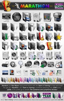
Marathon (Fullsheet)
In the Marathon Icon suite I tried to capture the scope of running a marathon by creating a uniquely colored IconPackage for each mile of the Marathon -  26 IconPacks for 26.2 miles. The result is an amazing variety and over 1200 icons that will complement any desktop. To top this all off I included three additional IconPacks, themed for the “Team in Training” so you can show your support to the world, making a total of 29 IconPackages. This, to my knowledge, the largest Icon suite ever.

Stardock has been generous enough to join in my efforts, and will donate all the profits from this pack as well, so 100% of the profits from this suite will go directly to the The Leukemia and Lymphoma Society to help save lives. 

I hope you will join me in supporting this cause. As someone who has lost family to Leukemia, it is near and dear to my heart. On June 20th of 2009, my wife and I will be running across the finish line in Alaska, in memory of my Uncle, and in support of my brother-in-law. In the end it will be those of you who support me by purchasing the “Marathon” suite Team in trainingthat will have made it possible.

For additional information about our story, or to donate directly to the cause, go here:

For additional information about The Leukemia and Lymphoma Society, go here:

If you don’t already have IconPackager, you can download try it out, get it here.

To help save lives, and get the full 29 pack suite, go here.

[more]

11 Replies Reply 37 Referrals

Last_LogoI will be out of the country for the next week, so I will be putting the Icon-A-Day tutorials on hold until next Thursday. Luckily I had found something good to post that should be able to give everyone something to play with while I am MIA.


Tuesday, August 26th, 2008 Line

Bringing LaST up to date
Last_FolderMonths ago I was asked to update the IO Iconpack for MyColors. Since IO is, at its heart, a modified version of the LaST icons, I ended up doing almost all the work need to update the complete LaST icon pack. So this weekend I was able to go through and polish off the rest of it. The result was a brand new, Vista version of LaST Cobalt.

There was quite a bit of work that went into this update, so it is not really possible to do a step-by-step tutorial of the update, rather I decided to go through and show a few of the highlights of what went into the update.

Vista User Folders:
One of the biggest charges in Vista is the addition of several new User folders, as well as the new User folder structure. Several of the existing folders still worked; My Pictures, My Music, etc. However, I had to go through and create several new icons that are only used in Vista, such as Downloads, and Contacts. LaST_User_Folders
Live Folders:
The Live folders were the biggest obstacle in updated this iconpack, since the folder form factor is so non-traditional. So I had to do some tweaks, and I ended up simply creating a version of the Last folder on its side. With a few more tweaks I was able to make the Live folders work, though they obscure a bit more of the thumbnails than I like, but because the folder is translucent it still worked out ok.
Last_Live_Folders
Last(Vista)preview_Thumb Bringing along the rest of our friends:
The original LaST icons we designed for a Mac icon contest, and then brought over to 9x, and XP, so it contains many icons that are not used by default in Windows Vista. But since I have all the original icons saved in nice, clean 384x384 PNGs. I was able to create new Vista style icons of even the most obscure Windows 98 icon. I can say that this new pack includes every LaST icon I was able to fit in it. 

Even though I stuffed this iconpack with all the LaST icons I could, I there are still many more miscellaneous icons, that I currently have posted over in the Object Dock Library. I will be updating them to the new Vista standard soon.
Wrap Up:
Since I created these icons I have learned a great deal, including ways to automate many of the steps required to create sub-packs. I have always wanted to create some other color versions of these icons; Black, Ruby, and such. I am considering putting these together, but I am going to wait to see if people use these. I know they are a bit dated in style. Let me know weather you would like to see a few more LaST Iconpacks, and if so what colors you would like. 

About Me:
You can find all my skins, tutorials, and articles, on my Wincustomize Homepage, at http:\\mormegil.Wincustomize.com. Questions on icon use and techniques, can be emailed to mormegil@gmail.com. Twitter users can find me with the user name: Mormegil.

Download the LaST 2.0 Iconpack: 
Get today's iconpack from the  IconPackager Library.

Find all the Icon-A-Day tutorials, and links to the icons and more at the Icon-A-Day 2.0 Index.
All Icon-A-Day artwork, copy, and icons, are copyrighted by Paul Boyer © 2008, and may not be used with out express permission.

4 Replies Reply 57 Referrals

Before we get to much further into the 2.0 update of the Icon-A-Day icon package, I want to take a moment to create a new index page so we can keep track of each step in the process. 


Day 6
(Monday, August 11th, 2008) Line

This index will give us a convenient home for the Icon-A-Day 2.0 project. As the project continues I will update this index with links to each of the tutorials. Unlike in 2.0, this index will be organized by day, not by icon.

Day 1, System Folders:

Day 2, Basic File Types:
 

Day 3, Closed Folder
 

Day 4, Open Folder
  

Day 5, Live Folder
 

Day 7, Data Folder

Day 8, Wrapper Folder 
 

Day 9, Favorites Folder  
 

Day 10, Pictures Folder   
 

Day 11, Downloads Folder 

Day 12, Links Folder    
 

Day 13, Music Folder    

Day 14, Videos Folder 
 

Day 15, Search Folder 
 

Wrap Up:
This index is for the Icon-A-Day 2.0 updated icons only. For the original Icon-A-Day tutorial Index, click here. For more details on the CorelDRAW techniques used in both the 1.0 and 2.0 tutorials, check out the CorelDRAW for Skinners tutorials here.

About Me:
You can find all my skins, tutorials, and articles, on my Wincustomize Homepage, at http:\\mormegil.Wincustomize.com. Questions on icon use and techniques, can be emailed to mormegil@gmail.com. Twitter users can find me with the user name: Mormegil.


All Icon-A-Day artwork, copy, and icons, are copyrighted by Paul Boyer © 2008, and may not be used with out express permission.

4 Replies Reply 39 Referrals
Last week I was lamenting that we were done with the simple User folders, but wait, I forgot one. I missed it because it did not exist in XP. After digging around in the original icons, I realized that we have pretty much have everything we need to make the new Search folder.


Day 15
(Monday, August 25th, 2008) Line

IA_15_SearchThe Search Folder.
When I started looking around the User folder today, I noticed that the the Search folder would be pretty simple to put together. I also noticed that the existing Search folder seems to have been put together in a rush as well.

It looks like they were originally just going to do the glass bits in the Wrapper folder, then decided it was not "search" enough, so they grabbed a magnifying glass and slapped it in front of what they had. The folder has one shadow, the glass has another, and the folder has a perspective 3D look. The glass is flat, and straight out of a Photoshop tutorial.

This lack of continuity with the rest of the User folders is kind of sad considering how much time and effort went into the Window Vista icons. The good news is that we should, in very few steps, be able to create something better. 

Step 1:
Once again we gather our assets together. All we will need is the Wrapper folder, the 1.0 Search icon (#81) and the File icon we created on day 9 for our Favorites folder.


IAD_15_S1 

Step 2:  
Now as luck would have it we can pretty much just flip our existing search icon, size it and skew it just a bit, and it works pretty much perfectly with our Wrapper folder. Even the shadows and reflections still work with a bit of cropping. 

IAD_15_S2

Step 3: 
At first I was just going to put the glass in the Wrapper and call it a day, but we can do better.

Lets put a few files in the folder. They will be blank, so I remove everything but the top bars from the file. I also tweak the fill just a bit, because I want the color to wrap around the edge of the file.

IAD_15_S3 
 

Step 4:   
Now we simply duplicate our file 3 times, and change the color of the bar on each.  Once I am happy with them, I move them into the Wrapper.

While we have them together, I go ahead and touch up the gloss on the files.

IAD_15_S4

Step 5:  
Tonight our classic last step is made much simpler by the fact that most of our shadows and reflections are good to go. All we need to do is give the treatment to the files.
IAD_15_S5

Finished Icon:    
There we go, a new Search folder, this time with some continuity.


IAD_15_S6

Wrap Up:
Tonight's icon, will be the last Icon-A-Day icon until next Thursday, since will be on vacation. I will, however, be back tomorrow with a special Icon-A-Day supplemental. Check in tomorrow night for a special surprise. 

About Me:
You can find all my skins, tutorials, and articles, on my Wincustomize Homepage, at http:\\mormegil.Wincustomize.com. Questions on icon use and techniques, can be emailed to mormegil@gmail.com. Twitter users can find me with the user name: Mormegil.

Download Search Folder Icon: 
Get today's icon from the Miscellaneous Icons Library.

Find all the Icon-A-Day tutorials, and links to the icons and more at the Icon-A-Day 2.0 Index.
All Icon-A-Day artwork, copy, and icons, are copyrighted by Paul Boyer © 2008, and may not be used with out express permission.
3 Replies Reply 27 Referrals

My original plan we to do a Video tutorial of today's icon, however after I got all the assets together I realized there was nothing particularly difficult. I realized that we can pretty much do today's icons by just tweaking our existing assets. So it looks like our first Tutorial Video will have to wait for a bit, but some videos will be coming along soon. Promise.


Day 14
(Friday, August 22th, 2008) Line

IAD_14_Video_Folder The Videos Folder
Yesterday I mentioned that the Music folder was one of my favorites from the original series. Today we will do one of the icons I was never happy with: the Videos folder.

The thing I did not care for on the original Videos folder was the film reel. Luckily I did create a clapper for the Video file, so we have something else to fall back on. So with that said, we are going to ditch the film real for good.

Step 1:
Let us start by getting our assets together, and removing the objects that we don't need. 

You can see our original Icon-A-Day 1.0, Video file in the line up.

IAD_14_S1

Step 2:  
Now, just to make sure our basic composition works I move all our original assets together. If we were in a hurry, we could probably use this as our final icon, but we will be doing some tweaks to sexy things up a bit.

IAD_14_S2

Step 3:
The first thing I want to do is replace the film images with something a bit more colorful Iin order to do this I'm going move the film strip out on its own for a bit.

Then, using the same techniques we used on the photos folder, I bring in a new image, duplicate it 3 times, and skew and crop the images to where they fit in the film.


 IAD_14_S3

Step 4:  
Now I want to change the copy on the clapper. I do this with the standard Text tool, and the Perspective tool.

IAD_14_S4

Step 5:
Now we we start fixing some things. It looks like we can re-use the shadow on the video file. But we will need to crop it where it hits the back of the folder.

I can also use the shadow, for our drop shadow by skewing it and dropping it behind everything. Then I fade it out with the interactive Transparency tool.

 IAD_14_S5

Step 6:
Now we use shadow and reflection techniques to polish things off, starting with a few new shadows, 


IAD_14_S6

Step 7: 
Last we finish off the the reflections, starting with the reflections in the folder front, and finishing up with the traditional floor reflection.

  IAD_14_S6

Finished Icon:    
Here we have our the last of our classic "My" User folders.


 IAD_14_S7

Wrap Up:
With the Videos folder we come to the end of week 3 of our Icon-A-Day 2.0 tutorials. I'll be back Monday with another User folder, and since we are just about out of the classics we will need to create something new from scratch.

About Me:
You can find all my skins, tutorials, and articles, on my Wincustomize Homepage, at http:\\mormegil.Wincustomize.com. Questions on icon use and techniques, can be emailed to mormegil@gmail.com. Twitter users can find me with the user name: Mormegil.

Download Videos Folder Icon: 
Get today's icon from the Miscellaneous Icons Library.

Find all the Icon-A-Day tutorials, and links to the icons and more at the Icon-A-Day 2.0 Index.
All Icon-A-Day artwork, copy, and icons, are copyrighted by Paul Boyer © 2008, and may not be used with out express permission.

0 Replies Reply 144 Referrals
Today we will dive back in to the core user folder with the Music folder. We will be basing it on our Original Icon-A-Day My Music Folder, and will be using almost the same exact steps. However, because of the change in folder size, we will need to recreate almost all the assets for our 2.0 version.


Day 13
(Thursday, August 21th, 2008) Line

IAD_13_Music_Folder The Music folder
The original Music Folder was one of my favorite icons in the Icon-A-Day series. It was one of the first special folders we did, #5, and it set the standard for the overall look of the folders in the pack.

I want to do pretty much the same type of thing with the 2.0 version. We will do a nice disc or two in the folder, and scatter in some pretty candy-like notes. We might even be able to salvage a few assets, however I am going to take this opportunity to show how we make the notes, as well as the disks. We will be doing this in almost exactly the same way as we did them 3 years ago, so I recommend that if you have any questions I don't cover here that you take a look at the original tutorial.

Step 1: 
We can start once again by grabbing our Wrapper folder, and our original Music folder.

Then we remove the assets that we will not be able to use.
   IAD_13_S1

Step 2:  
I keep all the notes and the CDs, though I don't know if we will be able to use them. I mostly want to be able to use them to copy effects and fills from them, while we create our new assets.

That said, I quickly create new ones as simple objects, using circles and boxes.
IAD_13_S2
When I have the shapes, I weld the notes together. I also combine the circles together, creating an inner and outer ring for our disk.

Step 3: 
Before I go any further, I group our two disk circles together, so that I can apply a perspective to them.

Now I use the Perspective tool to quickly give our new notes new perspectives. I also do the disk at this point. 

  IAD_13_S3
Now it looks like we won't have enough room to get our green note in without crowding the composition. This frees us up to move on to our fills. We will start with the CD.

Step 4:  
I give the main body of the CD a nice Conical Fill, copying the colors from our original CD. Then I give the center ring a gray to white liner gradation.

I give the same fills to the rear disk, however when I'm done I tint them 2 clicks black, to darken them up.

Then I copy both rings one more time, move them behind the originals, and over to the right a bit, to create the illusion of thickness. I also tint these a little darker.

IAD_13_S4

Step 5:
Now we need to make the inner rings of the disks transparent, which we do using the Interactive Transparency tool, and give them a liner transparency.

At this point we need to use our front circle to crop the copy of it we made in step 4, so we can have a lip yet be able to see through the "Glass." We need to do this twice, once for the inner lip, and once for the outer lip. 

We do the same thing for the rear disk.

IAD_13_S5 

Step 6:
Before we give the discs gloss or shadows, we will go ahead and move on to the music notes.
 
We will be doing them with mesh fills and blend groups. We start with the blend. First I draw a fresh ellipse over the bulbs of our notes. Then I copy that ellipse and make a smaller version, down toward the bottom of the other. We make the larger one the same color as our note, and the smaller one a lighter blue.

IAD_13_S6

Now we just blend the two ellipses together.

Step 7: 
Next we draw two new mesh rectangles to give that glossy look to the rest of the note.

IAD_13_S7

When we are done with the blue note we do the same thing on the new red note.
 

Step 8:  
Now we need to go through all of our new shapes and create new gloss, which we do this with our standard gloss technique. We have to be careful to crop some of the gloss on the Wrapper folder where it would be occluded by our new objects. IAD_13_S8

Step 7: 
Once again our last step is the Shadows and Reflections. These are a bit more difficult than normal, because we have a lot going on, and several reflective surfaces to keep in mind. See shadow and reflection techniques for more.  

IAD_13_S9

Finished Icon:
Here we have it, the new Music folder. I think it stands up well when compared to our original. 

IAD_13_S10

Wrap Up:
With the completion of the Music folder we are over half way through the User folders. Tomorrow we will end the week with a Videos folder. Who knows, we might even be able to do it in a Video.

About Me:
You can find all my skins, tutorials, and articles, on my Wincustomize Homepage, at http:\\mormegil.Wincustomize.com. Questions on icon use and techniques, can be emailed to mormegil@gmail.com. Twitter users can find me with the user name: Mormegil.

Download The Music Folder Icon: 
Get today's icon from the Miscellaneous Icons Library.

Find all the Icon-A-Day tutorials, and links to the icons and more at the Icon-A-Day 2.0 Index.
All Icon-A-Day artwork, copy, and icons, are copyrighted by Paul Boyer © 2008, and may not be used with out express permission.
1 Reply Reply 31 Referrals

Today I spent most of my Icon-A-Day time figuring out how to get some videos to integrate in future tutorials. Unfortunately this left me with very little time for tonight's icon, but luckily we have a quick one available; the Links folder.


Day 12
(Tuesday, August 19th, 2008) Line

IAD-12-LinksThe Links Folder
The Links folder is another of the new additions in Windows Vista. It is simply a User folder where the user can place shortcuts. All the shortcuts in this folder are then made available in all the Explorer Windows.

Tonight we will be able to save a ton of time, because all we have to do is take yesterdays icon and replace our Download arrow, with a Links arrow.

Step 1:
We start my making a copy of our Downloads folder from Day 11.

 
IAD-12-S1  

Step 2:  
Now we simply delete the download arrow, the shadows, and the gloss that we created for it. 

While we are poking around, we go ahead and change our background rectangle to blue.

IAD-12-S2

Step 3:
Now we we pick up pretty much exactly where we were in yesterdays step 4. 

We draw a new links arrow, and give it a contour -remember to break the contour group apart - and regroup our the two objects together again.

 IAD-12-S3

Step 4:  
We take our group and give it some perspective with  the Perspective tool.


IAD-12-S4

Step 5:
Now we give it our poor mans bevel (from yesterdays step 6).


IAD-12-S5

Step 6:
Now we give our new interior arrow the inner glow. This will be exactly the same as yesterdays step 7, the only thing different is that we are using blues instead of greens.
IAD-12-S6

Step 7: 
We finish up with the same steps as yesterday. Give it new gloss, then we polish it off with the classic shadow and reflection techniques

  IAD-12-S7

Finished Icon:   
Sadly we this was our only remaining super simple User folder icon, but here it is: the Links folder.  


IAD-12-S8

Wrap Up:
That is it for our Links folder, quick and dirty. Tomorrow, I will be at a meeting of the Michigan Independent Game Developers, so we will have to wait until Thursday for Day 13, when we will do one of the more interesting User Folder icons, maybe by then I will know which one it will be.

About Me:
You can find all my skins, tutorials, and articles, on my Wincustomize Homepage, at http:\\mormegil.Wincustomize.com. Questions on icon use and techniques, can be emailed to mormegil@gmail.com. Twitter users can find me with the user name: Mormegil.

Download Links Folder Icon: 
Get today's icon from the Miscellaneous Icons Library.

Find all the Icon-A-Day tutorials, and links to the icons and more at the Icon-A-Day 2.0 Index.
All Icon-A-Day artwork, copy, and icons, are copyrighted by Paul Boyer © 2008, and may not be used with out express permission.

0 Replies Reply 17 Referrals

 
Page 1 of 22